Monday, 24 March 2014

Decomposing fruit


Proposal

The background information of the project was are tutor gave us a task to do the work sheet had four different themes glass, time, space and heavy, we had to relate things to the words so say we did heavy I choice metal because its heavy so its about relating things to the theme. We had to pick one of the themes that was on the sheet so I picked time so I was going over it in my head thinking what I could do, after coming up with different ideas I came up with decompose because it takes time for something to decompose over a period of time. So that’s while I will be taking pictures of decomposing food/fruit.

The brief scenario is that a big design company to make this creative brief and produce research has taken us on, pre-production and edited finished photographs based on the themes we was given by are tutor, we could choice any of them theme’s following any format advertising, landscape, fashion or documentary.

My goal is to capture these images in a way that hasn’t been done before and also to represent the theme time using decomposing food/fruit.

My idea doesn’t have a specific audience because anyone can understand the concept of the idea. Looking at Young and Rubicam’s it fits the category of the explorer because it’s for people who are interested in organic matter and how we are organic matter it’s aimed at older teenagers 18 and upward because we value are judgment and opinions on organic matters, I think it fits this category because food is again an organic matter, I want the audience to see how we are all the same as an organic matter.

My photographs I will be shooting at home all next week from the 31st of March to the 6th of April, I will take a photo everyday of the week to show how food/fruit decompose over a period of 7 days. I don’t need to spend any money because I have fruit and veg at home.

My idea is to have either a storyboard of the fruit so you see everyday for seven days or I may have one side of the picture of the food fresh and the other side of the picture where it is all mouldy and green in the decomposing stage. The first image will be of and bitten apple going all brown and crusty so it showing decomposing, my second image will be of a banana I will take a photograph of it fresh then a photography of it all brown and gooey (I must keep the same framing to it match the other half when I come to put it together in Photoshop. My third image will be fried chicken when its all dried out and started to grow white fungus but I wont be able to capture this till the third day because that’s how long it takes before it starts to grow the fungus I have researched into it. Finally my last photo will be of a potato growing its roots off it over the course of seven days.

Monday, 10 March 2014

photo richard

Here i wanted to capture in the photograph that life its always a straight easy road there will be twist and turns, but you must walk them stairs or road to get where you wanna be. I think i achieved this really well because you start from he bottom not knowing what you life will bring and then coming towards the top you know where you want to be in life and your heads clear. I shot this with everything manual focus i did myself and my ISO was on around 400. This represents time because it takes time to get there, where you wanna be in life.
In this photograph i wanted to capture the natural shape of the building because to me i can see more then one thing in the picture you if tilt your head to the left it looks like solar panels. If you look in the top left of the photograph you see a distance point. I cant remember what i shot this on. This represents glass  because as you can see its made from glass.


I wanted to capture the guy who is skating past because again it represents time, it takes time to get somewhere and how we all go about it in different ways to reach are destination. I think i have achieved this because we see him skating somewhere, he wants to be there in time and how he puts effect in to get to the place.

I just wanted to capture this because it looks like it becomes smaller at the end so again it has a looking distance.

I wanted to get this image because it feels like you cant be judge if you cant see someone. I think this achieve this very well because all you can see is a shadow so how do you know what the person looks like.

In this picture i wanted to capture the space because space is all around us and how we use space, we all use it differently from other people. I think it fits the title space because we see someone sat down that how he uses the space where as other people might use the space to do different things.

Again i have another picture of space because we can see the moon and i wanted to portray how vast space is and how big it can be. I think it fits the category because we see the moon and thats within space.


In this picture we see a statue of a man pulling himself out the ground and the facial expression suggest that his body is heavy so he's struggling, also the statue is also made from pure concrete so gain it will be heavy.


Thursday, 27 February 2014

Photography carol

Here is the original image i had chosen from the photographs that was taken, its a little bit dark so i am aiming to light it up in photoshop. 
In this image i started to mess about with the colour balance of the photo to try and get the skin tones more reddish because in the original the skin was really cold and lifeless so i wanted to bring some of the colour back into the face also the original image looked really flat, so i brought some of the texture back to the face.
The next step i taken to brighten the image was the vibrance. On the original image you couldn't really see the top i was wearing because again it was dark so i played around with the vibrance until i was happy i really wanted to bring out the yellow and greens in my top. Vibrance (+40), Saturation (+12)
Secondly, i wanted to brighten it even more to really bring out the detail in my face and my top so i went to exposure and started fiddling with it all i did was take the Gamma correction up by 1.00 and it made the colours really pop as you can tell the yellow is more in your face and you can see the green and the blues more where as you couldn't see it before.
Thirdly, i went on to the Hue/Saturation, i began to play around with it gain yo try get it even brighter. I turned up the lightness and took down the saturation a little, i was happy after that but there was something missing so i changed the Hue to a yellowish town and it made everything even lighter you could see the background, there was texture back on my face the shadows fell nicely.

This is my final image i ended up with, you can see everything where as on the original you couldn't make out the colours or the texture on my face. We also can make out the eye and the lips.

Monday, 4 November 2013

Evaluation


Evaluation: Album cover

Before I started taking my photos for my album cover I had to learn how to use the correct camera functions. Firstly we learned how to set the F stop, ISO and shutter speed, After that I first set the shutter speed to around 1/25 second and I then set the ISO to 400 after I set the ISO up I then went on to the F stop I set that around 5.2, I was using a 50mm lens for the portrait because this is the right focal length. After this I made the decision to try it at different shutter speeds to see what the effects it had on the photo it made me more confidant with the camera and getting to grips with the functions. After I finished taking the pictures of the idea I had in my head I looked though them to see if they was in frame and not blurry or out of focus, some of the photos was blurry and out of focus so I retaken the pictures again to try and get a better result, I then went though the pictures to make my decision in the end for which one to go for.

I picked this certain style of photography because it’s elegant but yet it makes a bold statement with a classy twist (the twist being high fashion). After taking inspiration from various album covers like Adele and Lady Gaga I decided to stick with the black and white after looking over all of the photos I stuck with the portrait image it worked better then all of the other images I had taken. It looked great over all after I desaturated the colour, the contrast of the colours are varied its not bland and has a good depth of filed. The shadows fall nicely because of the lighting on the shoot I used high key lighting so we could see the girl and what she is doing within the frame.    

The historical context of my photo relates to pop culture. I wanted to brake the conventions of a standard pop album cover, pop music has been put into this category where we have to sort of stay within bounders where we just see the artist featured on the album cover I wanted to do something different and make it interesting. I tried my best to capture correct emotion as my photo represents a memory. The emotion I wanted to get from this is about when we go out to pursue are careers and go some where we leave a loved one, are family and friends behind but we still have that memory of being with them and that’s what I wanted to capture. I think it came across quite well I think it has a strong emotion behind it we can see this by the way the girl kisses the manikin and has her eyes closed so it makes her look passionate. I also wanted to bring society into it I wanted to show that everyone is different why should we care of what other have say and how we judge someone.

Monday, 21 October 2013

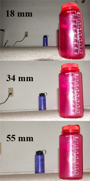
Focal length

 18mm focal length 

 35mm focal length

50mm focal length

Demonstrating camera techniques using are own images


Here i slowed down the shutter speed to create the blurred effect 1/15, as where if we was to increase the shutter speed his hands wont show up blurred 1/200.

In this image i have lowered the ISO to 200 and shutter speed and the F stop is around 8.2 to get an average depth of filed, but if i had the F stop on 12.0 or above it would of been a long depth of filed and the image would be more sharper where as in the photo above we see the foreground if sharper and the background isn't as sharp.


Monday, 30 September 2013

camera lenses


Macro lenses
picture taken from Wikipedia.
picture taken from Google images.

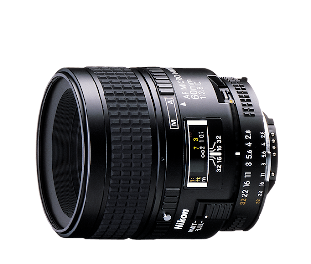
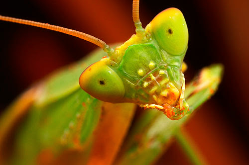
A macro-lens is a small lens, generally with a diameter less than a millimetre, and often as small as 10 micrometers. The small sizes of the lenses means that you can get some really good photos but sometimes it leaves so unwanted effects due to optical diffraction at the small features. A macro lens is normal used for taking extreme close such as bug or insets it captures a lot of detail as wee see on the grasshoppers face.

Wide angle lenses
picture taken from Google images.
picture taken from Wikipedia.


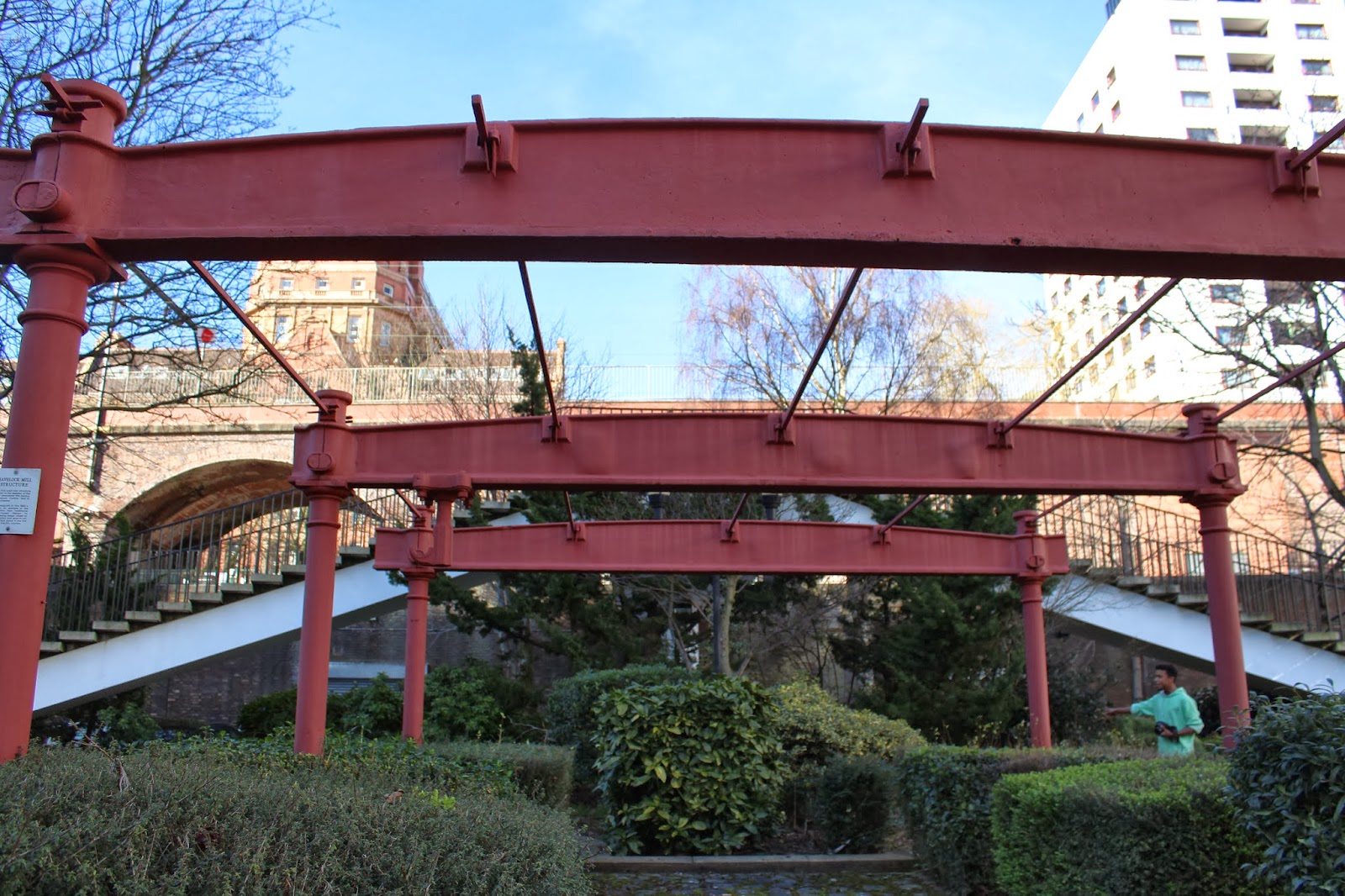
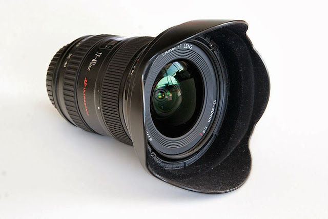
wide angle lens, these type of lenses allow more of the scene to be in the photograph. these type of lenses are used for architectural, interior and landscape photography, so the photographer cant move farther from the scene to photography it. Another way photographers use wide angles lens is to tell the different sizes of certain objects in the foreground and in the background, the fore ground image look really big and the background object seems really small as we see in the picture above.

Telephoto lenses 

picture taken from Wikipedia.com
picture taken from Photojojo.com
Telephoto lenses are long focus lenses, we see telephoto lens being used in in football match to capture the action from far away. But the slightest move of the lens the photo will be blurred and out of focus so you should always use a tripod when using these lenses, again this can be used we landscaping shots  of mountains and a city sky line.

Kit lenses 

image taken from digital-cameras-planet.com
These sort of lenses come with the camera when you purchase it, they are standard it produces a more look natural look like the human eye.